
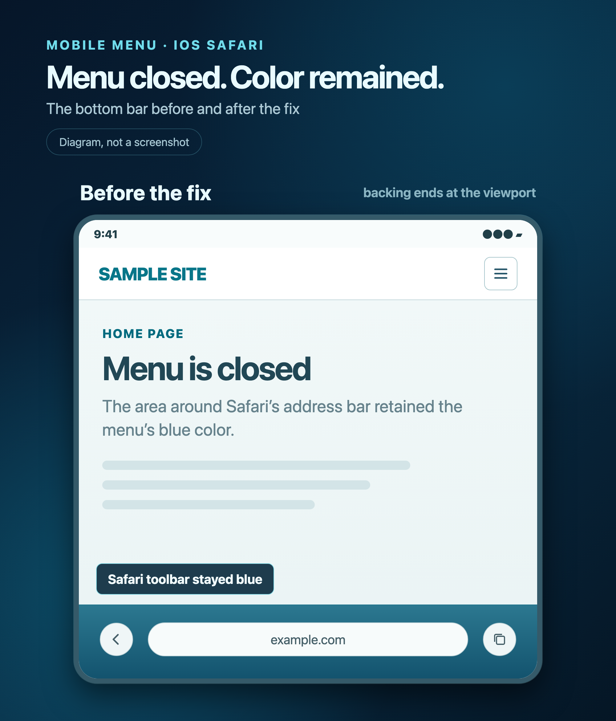
On an iPhone, we opened the mobile menu, closed it, and still saw a blue strip at the bottom of the page. The menu had moved offscreen, but Safari's bottom toolbar area kept its color. We could not reproduce the effect in a desktop browser, so we saved the original page and tested each change on the same iPhone.
What we checked first
We suspected a leftover page layer: the body background, a cookie notice, the header, or the closed menu. Covering the bottom edge with a light strip merely changed the artifact's color. We then looked for similar reports in WebKit discussions and developer forums.
We found no single official name for our exact artifact. In WebKit Bugzilla, the relevant terms are toolbar tint and solid background color extension. Another WebKit report calls a related effect scroll pocket tint when a fixed overlay appears; WebKit marked that report as a duplicate of a dialog-backdrop issue, so it does not establish the cause of our persistent strip. A Reddit discussion about iOS 26 Safari's transparent UI describes the bottom toolbar staying opaque after a fullscreen menu closes. A Stack Overflow question reports an incorrect bottom toolbar background color. These are related observations, not instructions tailored to our page.
These reports gave us useful context, but no drop-in fix for our layout. Switching from position: fixed to absolute looked promising because it removed a viewport-anchored layer. One later version did stop the blue strip, and we initially attributed that result to absolute. That conclusion was premature: several styles had changed together.
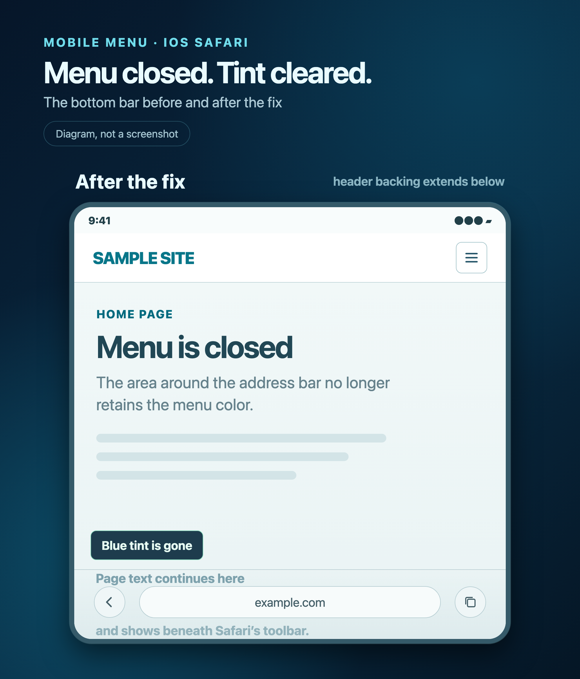
We went back to the saved broken page and changed conditions separately. The strip remained when we changed only the menu to absolute, changed only the page's positioning, or hid the menu completely after closing it. It disappeared even with the page and menu still fixed when an extended header background covered the area beneath the open menu. Removing that backing brought the strip back. Finally, we added only the extended backing to the original broken version. The strip disappeared on the same iPhone.
For our layout, the practical issue was the background coverage around Safari's bottom toolbar. WebKit describes how Safari can extend the color of a fixed or sticky element into an obscured browser inset so that a gap does not appear at the edge. That behavior fits what we observed. We have not inspected Safari's rendering internals, so we cannot claim to know the exact repaint sequence after closing the menu. We can identify the smallest change that removed the artifact in our device test.
The fix: extend the backing, not the menu
We kept the menu viewport-sized and retained position: fixed. While it is open, the header paints a separate dark blue backing behind it that continues below the visible viewport. When the menu closes, the menu-open class is removed and that backing goes away.
@media (max-width: 1060px) {
  body.menu-open .site-header {
    height: calc(100lvh + 240px);
    min-height: calc(100dvh + 240px);
  }

  body.menu-open .site-header::before {
    content: "";
    position: absolute;
    z-index: -2;
    top: 0;
    right: 0;
    width: min(420px, 100vw);
    height: 100%;
    background: linear-gradient(155deg, #071f35, #0d3e5c);
    pointer-events: none;
  }
}
This is the CSS from our controlled test, not a universal set of dimensions. The 420px width matches our menu, and the extra 240px provides coverage below our viewport. On another site, the backing's size and stacking order must match its own header and menu.
How to catch this on your site
Test the full cycle in Safari on an iPhone: open the menu, scroll inside it, close it, and scroll the page. Repeat while Safari's bottom toolbar changes size. Check two states separately: whether page content shows through while the menu is open, and whether the menu color remains after it is closed.
If a fixed or sticky layer reaches a viewport edge, inspect the background behind it and how far that background extends under the browser UI. Do not assume absolute is required. In our controlled test, the menu stayed fixed; adding an extended backing was enough to remove the blue bar.